
By: Jonathan Flieder
Layout is one of the most basic, fundamental and elementary skills for graphic designers. That’s because the same content can be arranged in a nearly infinite number of permutations. As a result, you have an incredible amount of latitude in determining the best approach, depending on the goals you are trying to achieve visually. Optimizing the proximity, relationships, spacing and hierarchy of visual elements to the numerous considerations like learner audience, emotional context, industry relevance and learning objectives, requires a careful, but deliberate balancing act by instructional designers and training professionals.
At a minimum, when you apply consistent spacing around objects, between lines of text, and throughout a course (or series of courses), you convey a higher level of professionalism. But there are even more important benefits. They include things like the gains in curriculum efficacy, the reduction of cognitive dissonance among learners, or the increased confidence for project funders. Read on to learn how to improve your instructional design products using these techniques.
Proximity, relationships, spacing and hierarchy of visual elements
Let’s start by naming things to avoid confusion. For the purposes of this article, an element can be any of the following, which may appear visually on your learning media:
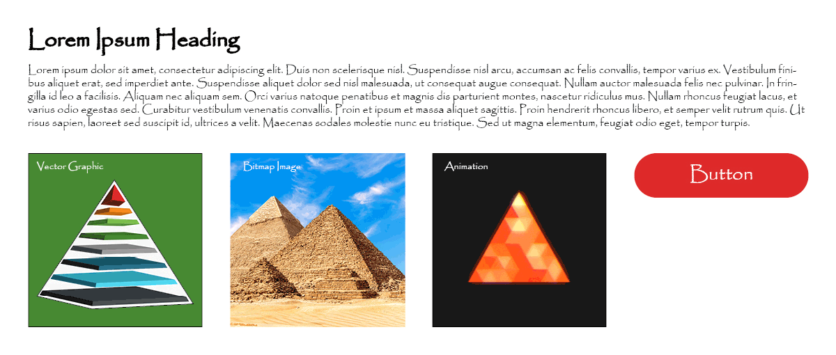
Text content, like a heading, title, sentence, paragraph, quote, or set of alphanumeric characters
Line art, clipart, logos, or other vector graphics
Photographs and bitmap imagery
Videos and animations
Forms and user interface objects
Now that we understand what are “elements” in this context, the next thing to discuss is their arrangement in a given layout. Mastering proper and consistent application of these four arrangement types to your learning media will help maximize its quality:
Hierarchy = how you intuitively rank the information presented in the elements.
Relationship = how elements are related to other elements.
Spacing = how much vertical or horizontal space is there between each of the different elements, as well as the bounds of the media.
Proximity = how close to or far away an element is from another element.
At first blush, it might seem that relationship is semantic or the same as hierarchy, and that proximity is just one type of spacing. However, as you will learn in the upcoming sections, they are not the same. Each of these arrangement types also requires a mutually exclusive consideration from the others, to help effectively achieve learning and communication goals.
Learning content hierarchy considerations
Hierarchy is principally concerned with depicting importance, or priority, and is probably the easiest aspect to understand when discussing visual design. In many ways, the concepts have some visual resemblance to how you perform skills decomposition. But this is what it boils down to, in graphics for learning.
The element that is...
proportionately largest in dimension,
most rare in quantity,
or nearest to the viewer,
...sits at the top of the hierarchy.
As elements grow smaller, or more numerous, or are further away, they fall lower in the visual hierarchy. That is one of the reasons why headlines or titles in newspapers or websites are usually larger (and bolded). Here are some examples of essentially how your brain ranks what it is seeing by most important to least important…
Large vs Small:
Clear hierarchy

Same Size:
Ambiguous hierarchy

Minority:
Clear hierarchy

Equal Quantities:
Ambiguous hierarchy

Close vs Distant:
Clear hierarchy

Equal Depth:
Ambiguous hierarchy

Whether you are building elearning courses in a games for learning format, presentation slides, or even printable job aids, it’s always important to properly define the hierarchy of elements. Otherwise, learners can easily be confused or misled about how the information they are observing or experiencing should actually be understood.
Learning content relationship considerations
There are many different relationships between learning content, beyond the hierarchal aspect that was discussed above. And although some of this may seem familiar, or even obvious, the key is that you match the best relationship to the content. Clearly understand the common sense, baked-in rules for each, and you will be able to organize your content in a logical, easily understood presentation that speeds up learning. Here are four examples of relationships applied to group content together in common “chunks:”

Non-ordered list
Groups similarly-weighted or -valued content together in a series.
Example shown:
bullet points

Ordered list
Groups similar element types in a sequence where one follows the previous one.
Example shown:
numbered steps

Pattern or matrix
Groups similar elements in a series whose constituents repeat at least twice.
Example shown:
table with rows/columns

Parent/child
Groups at least two elements together with one as subordinate.
Example shown:
image with caption
You probably realize that there are more than just these four content grouping relationships, but no others are more prevalent than these. As you build your learning materials, be sure that you always stylize similar relationships the same way throughout. That’s because the consistency that is important for hierarchy is equally important here, for many of the same reasons. So let’s use a non-ordered list as an example of what to do...

... and what not to do:

For this example, if you use bullet points with circles on one page of a handbook, be sure to use the same circles in the other sections of your module instead of another shape like a hollow diamond, a square, or a dash. And there shouldn’t be black bullets on one page, then blue on the next, then a green set on the next, and so on. Some of the areas to ensure consistency for non-ordered lists include:
Symbol shape
Symbol size
Symbol color
Text font
Text font weight
Text size
Text colo
Text line leading
Horizontal space between symbol and text
Vertical space before and after list
Learning content spacing considerations
Consistent spacing makes a world of difference in the perceived quality of instruction. Margins around the outside edge of content should the same size and consistent across all pages, slides or screens. And the spacing around similar elements should be the same unless there is a novel reason for distinction. Compare the spacing and layout of the same content in the two screens below, and consider what is different about them:

Which do you think looks more professional? Which has consistent spacing on the right, left, top and bottom margins around the content? Which has an equal amount of space between the headings and the text?
When spacing is consistent and proportionate, learning content has a more professional presentation. Content is also easier to read and understand when there is less variability with how elements are laid out.
Therefore, whenever you create new learning materials, begin by defining the spacing for elements and their container. Then continue to carry out that spacing rubric throughout each module screen, presentation slide, and/or whatever you are creating. That way they don’t change each time the learner progresses forward, and reinforce recognition by the learner, reducing mental load of visual discernment.
Learning content proximity considerations
These three content proximity considerations (labels, overlays and interface design) continue to reinforce learning efficacy by leveraging graphics for learning principles.

LABELS
As the visual example in learning content spacing considerations showed above, labels can be organized in a different ways, and some look better than others. In the initial version, the description is directly next to the item it is describing on the document. This is a good thing, from a proximity standpoint, even though the fonts vary in size, there are a rainbow of distracting outlines, and each box is in a different position.
When you have a single image, with a single label, that includes a clear caption there isn’t much room for confusion. But when the are a lot of labels, it can become challenging. This is because it takes mental processing time for learners to hunt down cues to what something is on screen, especially if it isn’t inherently clear.
And your labels may even provide more useful information than a simple alt tag would. They can pull double-duty, increasing contextual relevance or bridging the comprehension gap if the images are used for non-literal reference – such as in describing or detailing a metaphor, that makes sense because of the image used.

Overlays
There are many different ways to use overlays. Here are a few different examples of approaches you can use:
Full screen overlays that partially or fully obscure content underneath. These focus the learner’s attention on something in the foreground. One example is when we use a lightbox interaction; the learner selects a target object, then a semi-transparent overlay dims the content under whatever object or content they should be reading or seeing.
Full screen overlays that limit interactivity, depending on a variable like a user action or timeline incident. An example of this would be placing a 1% opacity / 99% transparent box over all elements in Articulate Storyline, that changes to hidden state when narration finishes and the user is supposed to click an object to proceed.
Overlays that stylize the background, foreground elements, or interactive objects. An example would be adding a 50% transparent black rectangle over a photograph, then placing a label on top that is white text, to maximize legibility while still showing some of the image beneath it. Another example would be creating a full screen rectangle with a partial gradient that you place in front of your background image or layer. If you have the gradient slightly change color or fade position while the learner moves through the content, there is a subtle visual providing a sense of progress.
These are just three ways that overlays can be used, and what they relate to, but there are certainly many more. In whatever way you choose to use them, be sure to properly focus the learner’s attention consistently, limit action in a non-frustrating way, and be purposeful about applying them to different shapes or elements for reasons of accessibility, rather than simply for aesthetics.

Interface design
If you are working in Articulate Storyline, Articulate Rise, Adobe Captivate, or another course authoring application, much of the interface design considerations are baked into the default player layout. But if you modify the player from its initial settings, or even use custom onscreen elements like buttons or menus you create to provide navigation actions, then UI elements should be:
Grouped in a similar location, like the left, bottom or right side of the screen (avoid the top because content should maintain top positional hierarchy)
Similar format, shape and color to each other, but different than any content elements they are near or that overlap (so they aren’t confused with content and don’t compete with it)
Proportionately smaller than the content to not compete from a hierarchy perspective, but large enough for user interaction (remember the audience and presentation mode characteristics)
Well-thought out and uncomplicated, so learners focus on content, not on interface
If you have a custom interactive object that serves an important navigational or learning purpose, be sure that any change states it has (such as when someone clicks it, or rolls a mouse cursor over it) doesn’t just include color changes. Subtle shape changes, outlines, icons, or outright change from text to image can help avoid creating difficulties for learners with accessibility needs.

Five visual element optimization best practices
We hope that your next training project is a smashing success, that the information provided can help you build elearning or instructor-led custom training on a budget. Here are five things you can do to apply these graphic design for learning principles of hierarchy, relationships, spacing and proximity to deliver an outstanding learning experience:
Common spacing factor. Pick a spacing factor, then generate a template that uses proportions of that factor. For example, Articulate Storyline’s render resolution is 72dpi but Microsoft PowerPoint default presentation render resolution is 96dpi. So using multiples of 18px for your element sizing and spacing will make them appear smaller on one application than the other.
Common sizing and proportions. Define common element sizes and proportions based on the hierarchy of content. Next apply schema mark-up standardization. By creating flexible master slides for Articulate Storyline and Microsoft PowerPoint, you will maximize consistency, all while saving time across coursework if there are any layout changes needed as the project progresses to final.
Visual element checklist. Don’t try to remember the nitty gritty of item dimensions. Instead, use a checklist to cover all the types of element arrangement permutations and reasons, then compare your materials against the list during each review phase so that if something changes you are able to change it globally.
Less is more. Avoid cluttering your materials with too much content for the space. Keep it clean, simple, and remember that decoration doesn’t reinforce learning.
Remember the audience. As you are deciding on sizing, proportions, relationships, and hierarchy, don’t forget usability by your audience. For example, include accessibility considerations with how you arrange content, such as if they may need to use tab navigation. Another example would be refraining from making non-responsive UI elements small, especially if the most common presentation platform will be a mobile device with touch interactions.
Related Articles For Further Reading

Using eLearning Graphic Design To Deliver Successful Learning Outcomes

Overview Of Accessibility Requirements For eLearning Course Module Design

Effective Games for Learning Design: Why Would Someone Want To Play This?
For more helpful information, read our overview of how to deliver successful learning outcomes with elearning graphic design.
Subscribe to our newsletter today to automatically receive the next issue in your email inbox.