
One basic principle in graphic design that is very relevant for creating effective elearning modules is that shape precedes color. To be more specific: our brains first interpret what our eyes see into shapes. They then interpret the color of those shapes for contextual understanding. So by defining how shapes are used to convey meaning and purpose in a given elearning project, we leverage the brain's hardwired visual order of operations to improve user experience and boost information retention.
Alternatively, if you ignore the importance of shapes and/or use them inconsistently to communicate meaning or purpose, then you are inviting confusion and cognitive dissonance for the learner. Here are five key ways we recommend using shapes to boost your training effectiveness.
Limit how shapes are used to specific purposes
When we talk about shapes, there are a huge variety to consider as you design a course. Let’s start by just looking at a few geometric shapes:
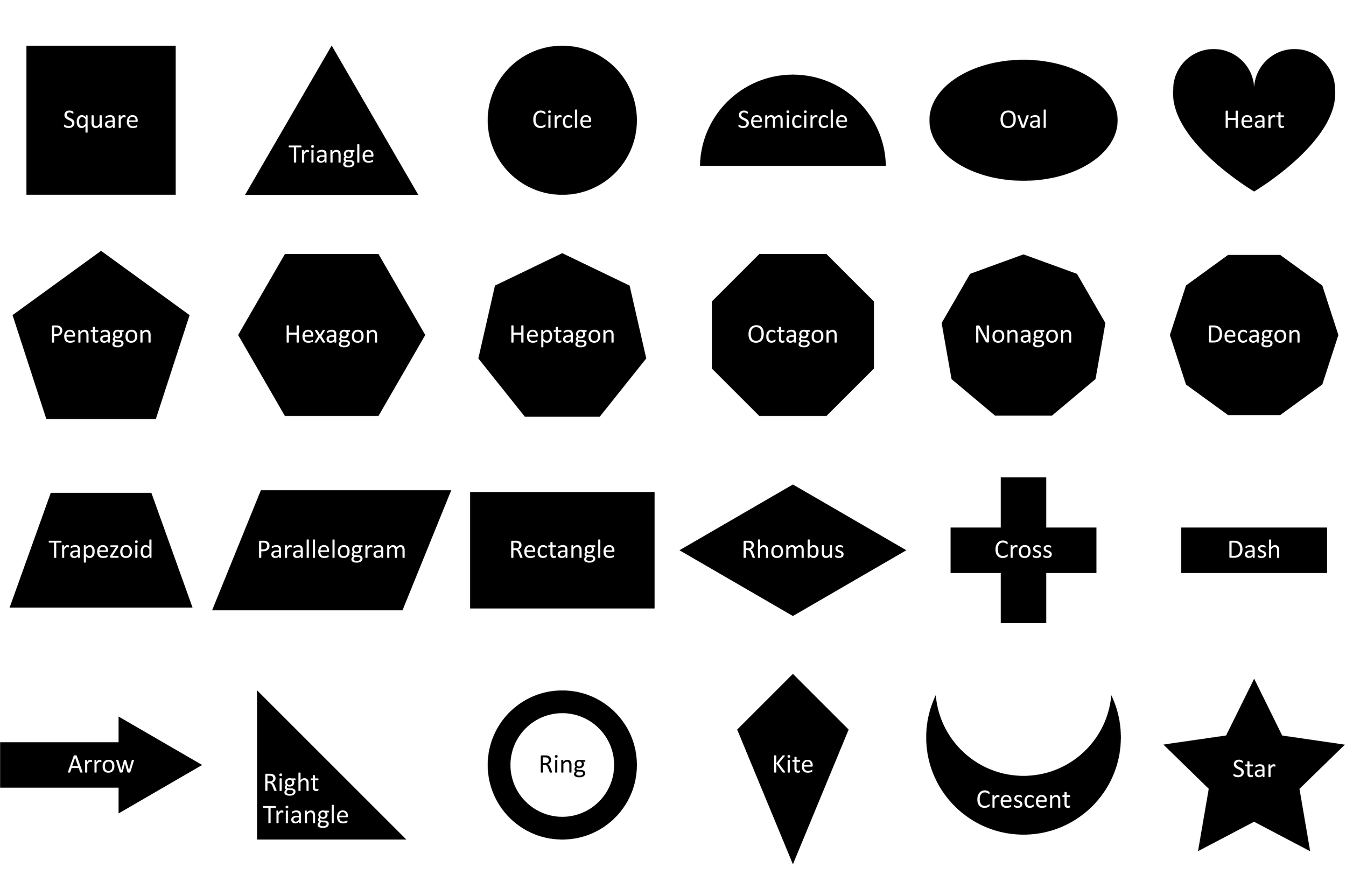
As you look at these different images, are there some immediate shape associations that come to mind? Here are four to consider:
Hexagon = Traffic Signal (Stop Sign) or Hardware (Nut)
Cross = Service (Medical Care) or Equation (Addition)
Heart = Holiday (Valentine’s Day) or Emotion (Caring)
Crescent = Religious (Islam) or U.S. State (South Carolina)
Although the shapes are simply a contrast between black and white within themselves, in the situational context of driving down a street, experiencing an injury, beginning a relationship, or practicing a faith, they can each hold greater significance to a learner. It’s important to select specific objects for specific purposes so that you do not add unnecessary mental discernment labor for the learner, or even convey an unintended message that reduces training effectiveness. Fully understanding your learning audience is critical, whether you are creating a simple PowerPoint course, or building advanced elearning modules that incorporate games for learning activities. Alternately, by using shapes in a way that cleanly follows popularly-held symbolic convention, you accelerate the absorption of learning because a learner is primed to relate the information within the correct context.
In e-learning courses, the shapes of buttons run the gamut from simple circles, to complex silhouetted figures. Whatever approach you use for buttons, or other objects that a learner will interact with, keep it consistent. Maintain consistent size, consistent style, and consistent location, as much as possible.
For non-interactive content like headings, body text, layout elements, or other decorative objects, try to keep it simple. Squares and rectangular shapes are frequently used for this purpose, because they easily organize their containing material into the pixel grid of the screen. This will reduce the amount of judgement a learner has to make about your interface, and keep them focused on the content.
If you are trying to direct a learner’s attention to a specific area, or designate a navigational direction for the learner to go, arrows and pointed shapes are a good choice. They connote the concept of a starting and ending point, which is precisely what you want to visually convey.
Avoid shape overload while gaining stakeholder advocacy
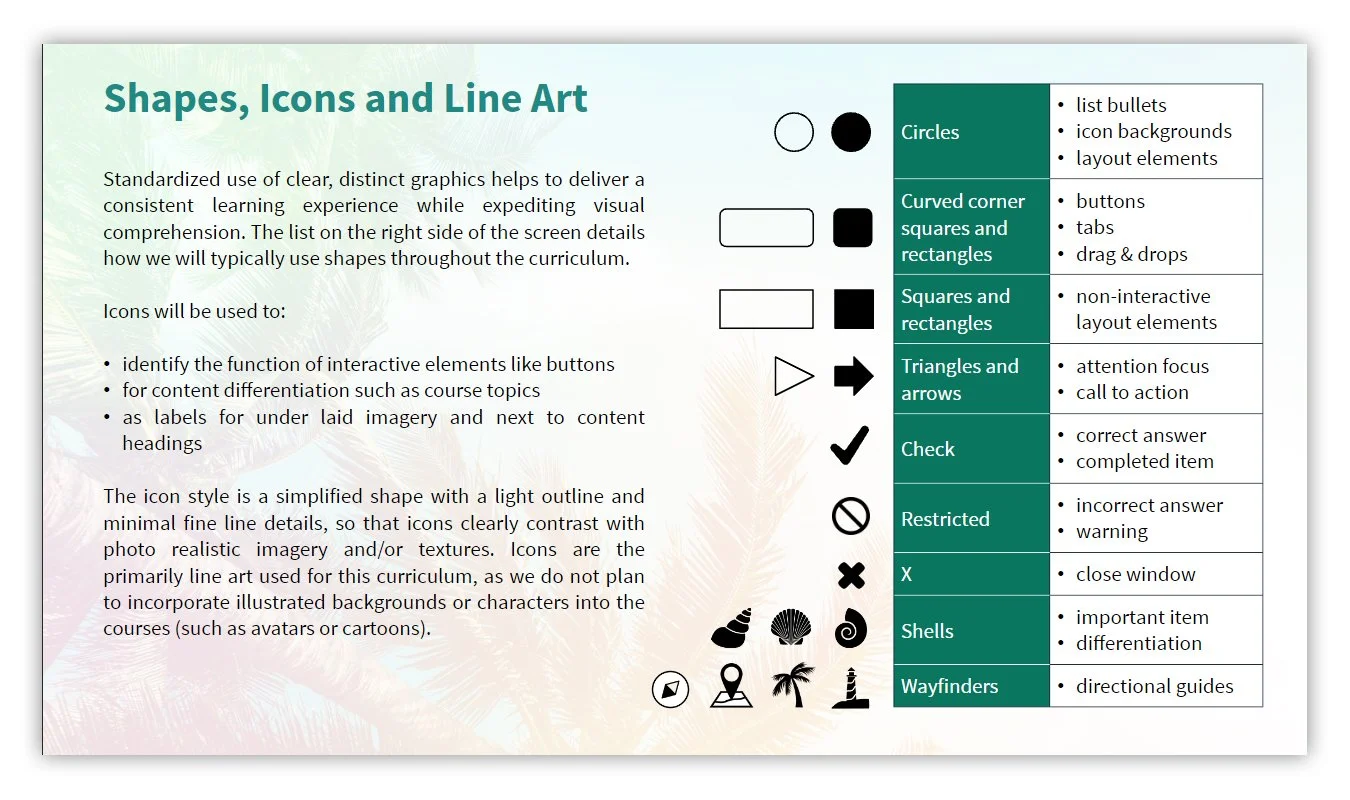
With so many choices, it may be tempting to use as many as possible, or to change them frequently throughout a course as a way of trying to maintain learner engagement with the material. The best thing you can do to combat this temptation is to create a style guide that clearly illustrates what each shape you use will symbolize, then stick to that. Here is an example:
The relevance and impact of this shape hierarchy model extends well beyond just the elearning creation aspects of a project. For instance, what if there is an effort underway to build a learning and mentoring experience where learners train in the flow of work? Or maybe you or your team is performing a job task analysis (JT/A) that precedes the elearning design and development phase. In either case, there will certainly be process flow charts, DDDs and other reports or documents that are informed by these activities. And many will include simplified visual workflows to help plan the content you will be writing, editing, and extrapolating into a curriculum that is delivered online. Therefore, by establishing shape purpose early on, you are reinforcing usage adherence at a deeper level, where it can further help embed content cohesion and continuity throughout all functional areas.
Client sign-off on shapes and purpose
Now although it may seem like an unnecessary step, consider getting a sign-off from your stakeholders at this point in a new project. Here’s why: imagine a scenario where you create these guidelines, spend your budgeted time building out the course modules, then when you get to the alpha testing stage, you receive feedback requesting all the “square” objects be changed to “circles” (for vice versa) for a more “modern” look. Depending on how your graphics are built, that could easily torpedo your target deadline, because now you have to generate hundreds of new graphics in multiple states or color variations.
Also, by enlisting their opinions, you are helping manage expectations and increasing the stakeholder buy-in of your work product. They may raise a question that you hadn’t previously considered, or even provide some deeper understanding of their brand, perspective, objectives, or expectations. And at the very least, they will appreciate how thorough and considerate you are. The person responsible for project management of your elearning project will also appreciate your initiative, because they may already feel like they are currently herding cats. Do your part to reduce unexpected back and forth due to stakeholder dissatisfaction, and keep design work on budget so they have less to stress about.
Decide when to shape objects for a particular aesthetic quality
Once you have a clear idea of the shapes you are using, how they will be used, and gained sign-off, it’s now a good time to take things even deeper. There are a lot of ways that shapes can drive higher engagement, and improve the overall attractiveness of your training materials. Here are three layouts of the exact same content, including headings, text, images, and interactive elements:
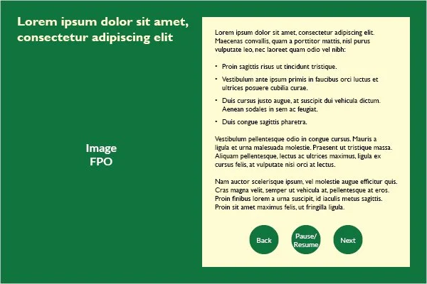
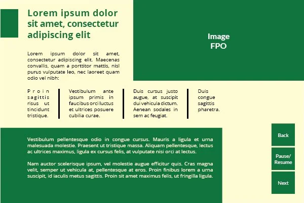
Which of these do you like best? Now think: which of these would your client or stakeholders like best? If they have graphic standards already, or an established brand, then there is a strong likelihood that they will have an opinion as well. So as you are deciding which objects should be shaped and how, keep in mind that your decision can have a dramatic effect on the underlying content.
For instance, let’s say you liked the layout 3 above. Now take a look at it with three different stock photographs about hiking in a forest, each focused on the subject of the photo at a different focal distance:
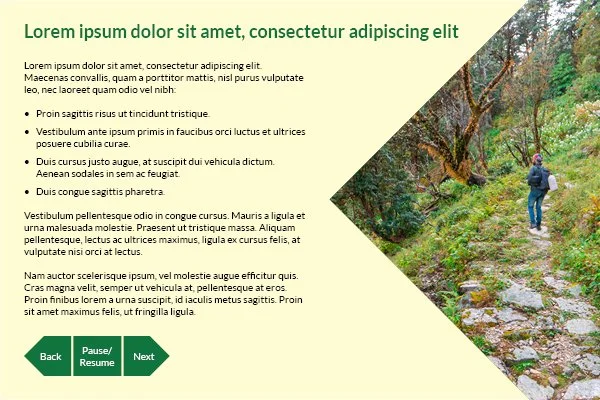
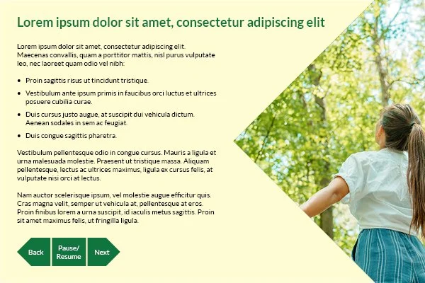
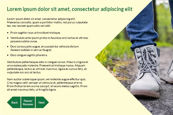
As you can tell, there is one that looks better than others, based on the image frame used and the range away of the subject. Therefore, when you build out your shape style guide and template layouts, keep in mind how a portrait-, square-, or landscape-oriented photograph will frame within its intended shape. And the same goes for vector illustrations, as well as graphical patterns.
Apply the same shape considerations to data representation
An infographic is defined by Merriam-Webster as “a chart, diagram, or illustration... that uses graphic elements to present information in a visually striking way.” For example:
A pie chart showing proportionate segments of a population, along with descriptive labeling that describes how certain health disorders are impacting each group is an infographic
An illustration that shows the passage of time, coupled with data points along the plane that connote how a decision impacted the different mix of products manufactured and sold is an infographic
A diagram that demonstrates a process flow and the decisions that must be made to achieve optimal performance is an infographic
Infographics are powerful tools for embedding important information in a learner’s memory. But they can also create overly simplistic messaging that obfuscates the complexity of reality, if not designed artfully. So to gain the most benefit, a designer should consider the right type of infographic for what they are trying to portray, how many components there are in the infographic, and what does the overall shape in the infographic convey. Here are two simple infographic examples of the same data presented in two slightly different ways:
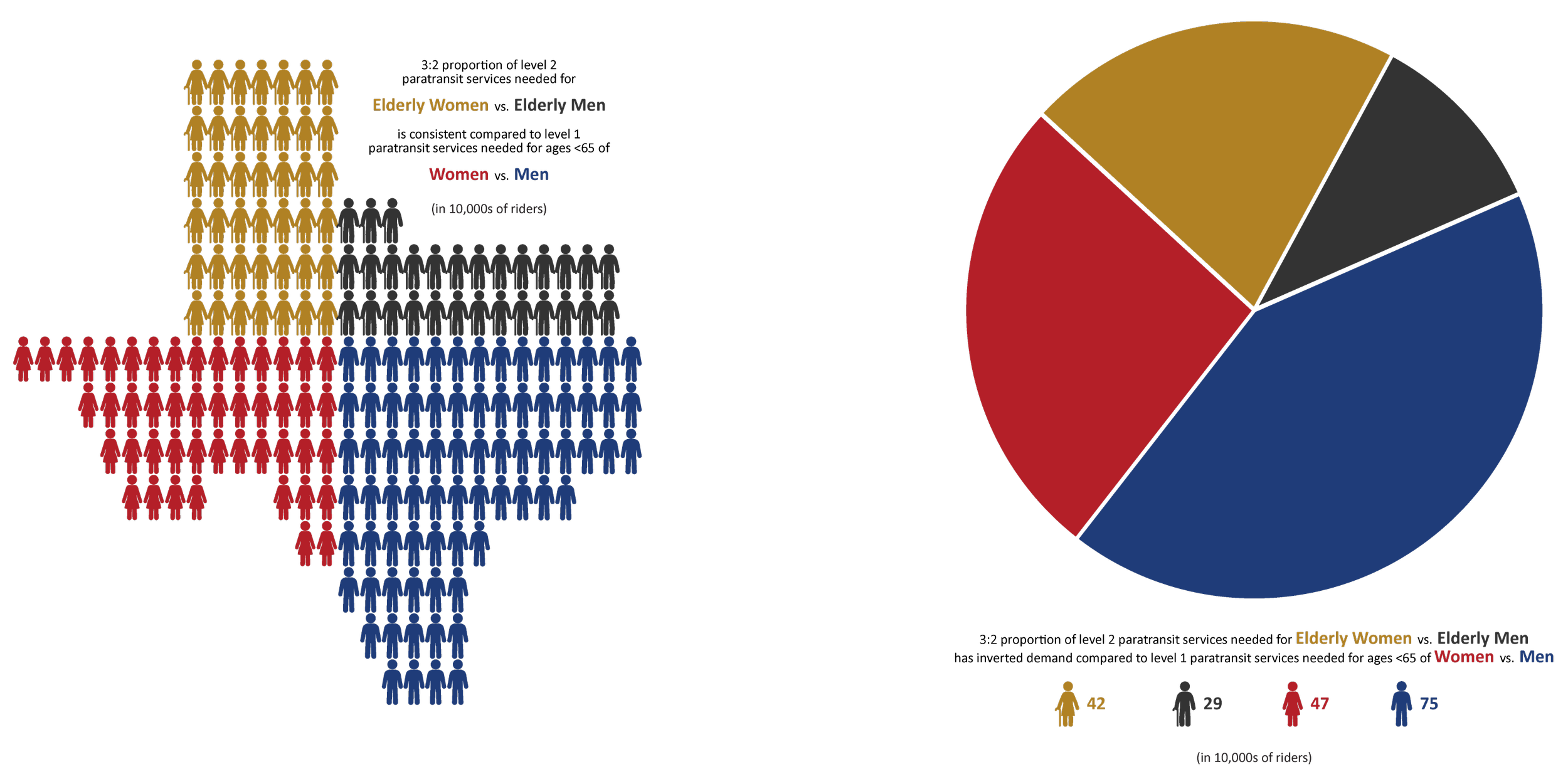
Both are charts: pictograph and pie chart. Both use the same coloring: gold, gray, red and blue. Each use the same fonts, and of the same text. So they differ primarily in their shape and approach. But now consider that the infographics above are supposed to be for an organization whose name and logo looks like this:
Now based on this additional information, which one would you now say makes a stronger impression? The pie chart is familiar and shaped similarly to the logo’s circle. And pictograph is Texas-shaped, making it relevant to the agency as well as reducing the need for a number key because of the information inherent to the type of chart. In both cases, the data reflects a comparison of an aging population to another group. Therefore, the primary difference is really just the application of an overall shape – and one feels a little better because of how it is designed, which can provide greater learner engagement and information retention.
Explore more ways shapes are used to convey meaning and purpose
There are numerous additional creative ways to use shapes in your courses to support learning. Here are a few more approaches that we recommend for helping increase learner engagement.
Create professional eLearning icon sets
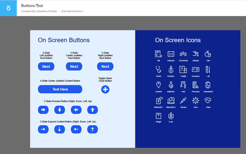
Select or build custom icon sets that adhere to the shape guidelines you have established:
Transform eLearning object shapes
Change an interactive navigational button into a different shape, or have embedded graphical elements that change depending on when a learner hovers over or selects it the object:
This technique is especially effective if your elearning project requires accessibility compliance because it is addressing learner populations with accessibility needs. Interactive objects cannot simply change color based on their state, but must also physically change shape, size, location, or in some other way that is immediately observable. This helps to not disadvantage learners who have color blindedness.
Design eLearning custom interaction layouts to match the content theme
For example, if your project is on trauma or PTSD, and you are using shattered glass as a thematic motif to support emotional component of content, you can create layouts like this one that mimic a broken glass mirror:
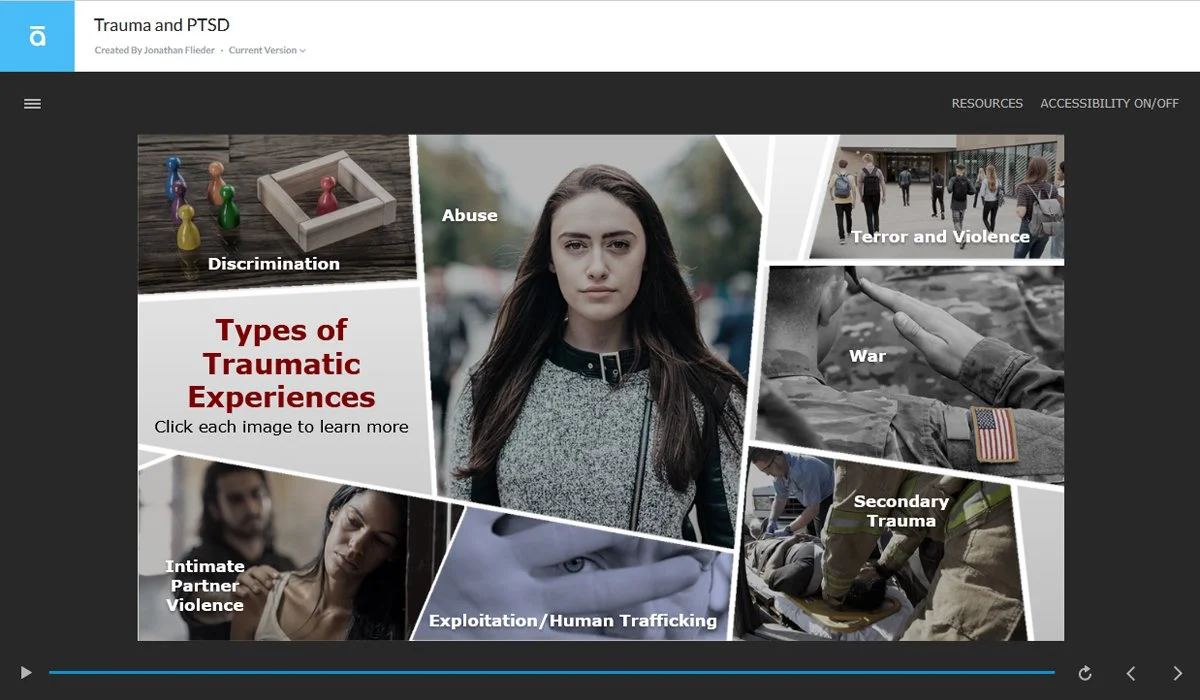
This approach is useful for integrating visual components more deeply into projects that address learners who are working with at-risk populations..
Shaping business success through your trainings
As you build your elearning course modules, remember that using shapes creatively takes careful planning for many potential scenarios, consistent application, and always checking for contextual appropriateness. There are a lot of ways this could go right – and wrong. So be sure to do your research, test and refine elements to the preferences of your client or stakeholder’s approval, then use shapes in a way that takes your training content to the next level.
Written by Jonathan Flieder and published in 2023.
For more helpful information, read our overview of how to deliver successful learning outcomes with elearning graphic design.
Subscribe to our newsletter today to automatically receive the next issue in your email inbox.
Related Articles For Further Reading

Using eLearning Graphic Design To Deliver Successful Learning Outcomes

Overview Of Accessibility Requirements For eLearning Course Module Design

Effective Games for Learning Design: Why Would Someone Want To Play This?